KIRIGAMI KEYBOARD
The Kirigami Keyboard is a native iOS accessibility app that helps dyslexic users communicate faster and with more confidence both professionally and casually.
My Role: Creator + UX Researcher + Designer | Status: Ongoing

OVERVIEW
When I set out, I looked to understand the unique strengths of dyslexic people and to see if there were any common struggles amongst them. From there I could put my UX skills to work and figure out a way to help dyslexic users utilize their strengths where they might normally struggle. I started by doing a lot of research. I gather my data by interviewing dyslexic people, consulting with professionals who work with dyslexic people, reading proper publications on dyslexia, and connecting with dyslexic communities on social media. with dyslexic communities on social media.
The biggest takeaways from my research are:

With this in mind, I designed and prototyped the Kirigami Keyboard. It’s a new kind of keyboard with pre-written message and email templates, rather than letters.It’s designed to help dyslexic users communicate more confidently and much faster, and through an experience that simulates the very tactile process of origami and kirigami (paper building and architecture). Through usability tests, I learned that non-dyslexic users really liked this and would use this as well.
OPPORTUNITY
Dyslexia affects the areas of the brain that process language, according to the Mayo clinic. People with dyslexia may have difficulty reading, writing, spelling, speaking, and grasping the understanding of words depending on where they fall on the dyslexic spectrum.


MAKING ASSUMPTIONS
Standard technology and text-based communication platforms can be limiting for non-linear thinkers given that it’s 2-dimensional and operates in a linear fashion. As a result, dyslexic people have a difficult time organizing their thoughts, expressing their words, and communicating ideas digitally.
HOW MIGHT WE provide dyslexic, non-linear thinkers with a tool that accesses their full capabilities and allows them to express their work and communicate in new ways.
RESEARCH
I wanted to create a tool that tapped into the strengths of a dyslexic person, rather than creating a tool that's corrective. But first, I needed to find out if this was something that dyslexic people needed or wanted. So I set out to do a lot of research.
USER INTERVIEWS
I interviewed a very diverse group of people with a set discussion guide of 16 questions. Even though I interviewed 5 dyslexic users I was able to get a LOT of data. Everyone was eager to talk about their dyslexia and had no trouble being vulnerable.
I created an affinity map with all of my data. The process of doing this helped me to empathize with my dyslexic interviewers who preferred to draw and handwrite on paper. This is also a method I prefer.
FINDING PARTICIPANTS
When I set out to find dyslexic interviewers, my first approach was to create a screener survey. I spent time carefully crafting the survey.. to later understand that this is not the right way to find my participants. Dyslexic people can really struggle with reading and also with too many choices, so they would be less inclined to take a survey.
My next step was to utilize my network. I reached out to people who work in Special Education, and in the Education Dept at a university, colleagues, and I to Dyslexic communities on social media.
To my surprise, I was connected with 3 of my interviewers through Instagram. Later to find out that Instagram was the favorite app amongst every dyslexic interviewer.
AFFINITY MAP:

Then I headed into Miro to finish gathering my insights, which is the foundation of the product I would be designing. Here are just a few of the key insights and categories from my interviews.
INSIGHTS:

PERSONA:

REVISITING THE PROBLEM AFTER MEETING OUR USER
Dyslexic users are frustrated and embarrassed from their struggle with having to compose written messages and emails for work-related communication. As a result, users take too long to respond to work emails and fear losing jobs from sounding too unprofessional and having too many spelling errors.
HOW MIGHT WE provide dyslexic users with a simple way to communicate digitally, in writing, that allows them to respond quickly and utilize their tactile nature?
Although I validated the initial problem space, my data showed me that dyslexic users were struggling with writing professional e-mails for work, so I set out to create an accessibility tool rather than something that helped dyslexic users utilize their strengths.
TURNING INSIGHTS INTO PRODUCT FEATURES

DESIGN + TEST + ITERATE
PLATFORM
The research I gathered from my User Interviews showed that Dyslexic users are on their phones a majority of the time. Interestingly, they prefer not to use their computer but they all liked iPads, or discussed trying one again. This narrowed down my platform options to a native iOS app, keeping in mind that this should be fit for an iPad as well.
MID-FIDELITY SCREEN FLOWS

USABILITY TESTS
Scenario: Your new business is growing quickly and you’re having difficulty keeping up with all your messages and email responses in a timely manner. A friend recommends the new kirigami keyboard that has build-in email and messaging response templates. Now that you’ve signed up and installed the keyboard you’re hoping it would help you to communicate faster.
Task 1: You want to start using the keyboard for work. Go back in and set your preferences so that it can help you respond to messages that are work-related.

Task 2: You’re in your email and you see that a potential new client just reached out to you. You’re excited about the project but you’d like to know more about it first. Go ahead and respond to the email:

Task 3: You’re in your email and you’ve decided the last person you interviewed would be a great addition to your team. So go ahead and tell them that they got the job!

USABILITY TEST 1
I asked 5 users to complete the three tasks to capture a baseline of the keyboard's functionality. Before testing to see if my keyboard would be helpful for dyslexic users, I needed to test that it worked, which meant non-dyslexic users could participate in this test. Four of the users were non-dyslexic and 1 user was mildly dyslexic. This scorecard shows how the users completed each task — directly or indirectly, the amount of time each task took and how difficult or easy it was.
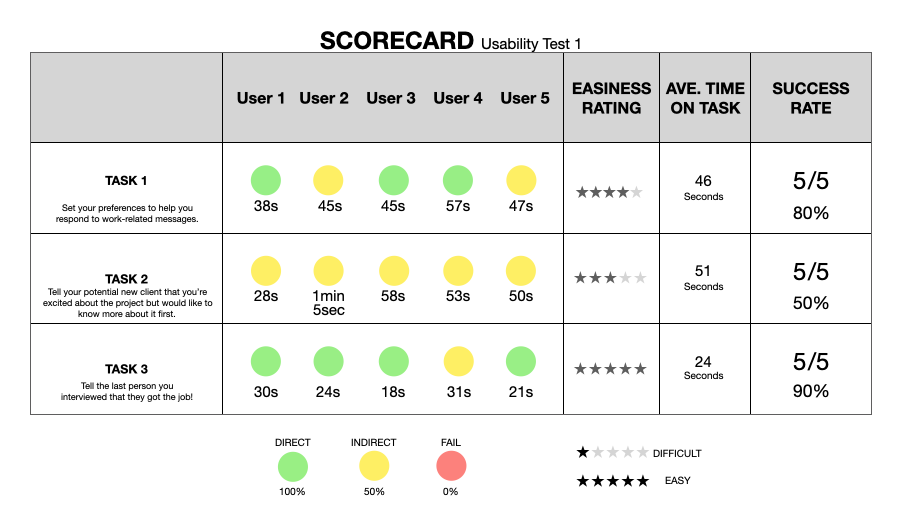
These results show me that Task 2 was the hardest task and took the longest to complete. So I should focus on those areas for my next iteration.
What I observed and heard from users was that:
They were unclear of what YES and NO were in response to
They accidentally miss-tapped templates and spent a long time reading them
Most of my users are right-handed and it was not right-hand intuitive

